First try
this site was founded sometime around mid-late march of 2023 out of some form of boredom and motivation in my system for learning html. but i gave up quickly. i had some form of html knowledge...though it was only the basics, like heading and p tags, and while it isnt that helpful, pretty stacked bbcode knowledge. used 2 frequent this forum-rp website that i will not talk about. i think its dead now anyways...
i remember the first like 100 updates i made: the neocities coding tutorial only took me so far, and id already known basically everything it had to offer...and, as you know, it left off on a note that just said "google it". so i turned to a friend i had become aquianted with in my small experiences with html: w3schools. i decided id just...follow every tutorial from the beginning they had till i knew what to do (weird and bound 2 be proven useless & waste of time from the start). i skipped some of the first ones since they already had stuff i new about, then stopped at tables. following a w3schools tutorial on tables, i made a table and colored certain boxes in the table pink then i tried to make a column layout, got confused (i was doing it wrong, i still didnt know how css worked, making it impossible to make a column layout) so i just gave up!
Site v1-v1.5
Im not sure when i decided to pick this site up again (from the records it seems like late may?), but its existance occupied a corner in my brain for a while till i decided to touch it again.
this time, i looked up a tutorial on column creation, and found the groundfloor layout tutorial. by this time i finally learned how to be smart and figured out how style tags worked (or i probably snooped in someone elses code to see how they added css) and...made a site! definitely was a site to behold.
the first page i made was what would become the albums page. my intention for this was a page to list my favorite albums in a "shelf-like" layout, then create passionate, custom subpages dedicated to each of them with their own layout, even longer rambles on my favorite songs, etc. i remember the first and only albums to be added there were jane removers fraility (goat) and bladees icedancer. its a cute and cool idea, and maybe i'll return to it one day.
this background is from somewhere i forgot. all the gifs are from gifcities, marking my discovery of the best site ever, and all the grids and boxes were coded using the skeleton of the groundfloor code. in the video its broken, the album covers used to be lined up four by four, thats why theres so many of the fraility cover (i was using it as a placeholder). if only my idiot brain could comprehend flexbox back then, this wouldve been so much easier..
the only one i ever made a proper page for was icedancer. it was meant to look like the feelings i had when listening to it/the album cover: bubbly, bright, snow and aquatic related gifs, sparkly, bootleg-like quality, etc. etc. a marquee in celebration of learning about marquees, glittery headings generated from picason, a soundcloud embed of all the songs for ~easy playing~ and random background of snowflakes falling or something because it was the best one i could find.
and finally the homepage. this scrollthrough is not an authentic, ~first edition~ version like the rest of these captures are, not as well preserved from me removing the images from my server and them not saving because this is from codepen and not a site download, but its the most functioning version (aka you can actually decipher whats going on, older versions just completely broke and theres no point in capturing them. but if youre interested, the internet archive files are linked above)
i remember being so proud of this page, despite being aware of how god awful it looked at any other display ratio that wasnt the one i have. if i had only knew about the z-index attribute and adding width:000px into the body css to make it a bit more bareable...
that beieng said. it was a fun idea with at least some stuff going for it. the header idea is cute, having butterflies and words come it, if not a bit laggy (but thats kind of a critism that could be levied at any of my (home)pages...) and was a solid execution of my vision. it passed my then expectations, so thats all i can ask for i guess ☺
ive talked about this a lot, youll probably see many references to this exact micro-story, but ths was a remake of a carrd i had. the carrds deleted too now, but just imagine this page but much worse. i had neocities on my mind while making that carrd. it was very unconventional. carrds, as you know, are just supposed to be a little hamburger of a site (though of course theres people who make them prettier and enhance them or whatever) but i wanted to make something that was more than that. i still didnt know how html worked, but i still wanted to make a site experiental and strange, so what i crafted was definitely that i guess!! but then shortly after making it, i was looking at other neocities sites and finally decided id give it another shot, and well, look where we are now i guess!!!!
site v2
8/28/23 Site capturevery "anything goes", no particular theme, mish mosh of styles. the idea i wanted to capture in this was one which used many styles and "tropes", i guess, of other sites in neocities web, and combining them into one clusterfuck of a site. each element would be distinct from another, with its own styling, theme, color scheme, etc. etc. (this made the code 1000+ lines long and unbarely hard to code since i put the css and html all in the same file.) this was coded in like 5 days and while i like it a lot, its unorganized layout makes it very hard to not only edit, but not notice those gaping holes yet to be covered with content. its also just too bright on my eyes. color is good, and lots of organized, curated colors in specific areas, for sure, but combined with the background this was a lot to visually digest! also, so many gifs in that banner..so many gifs everywhere made my computer fan fucking roar.
i still like it a lot, and removing it was a lot on my heart. i had fun creating it, styling each of the elements, making them different and blessing each one with a theme and corresponding color scheme, etc.
site v3
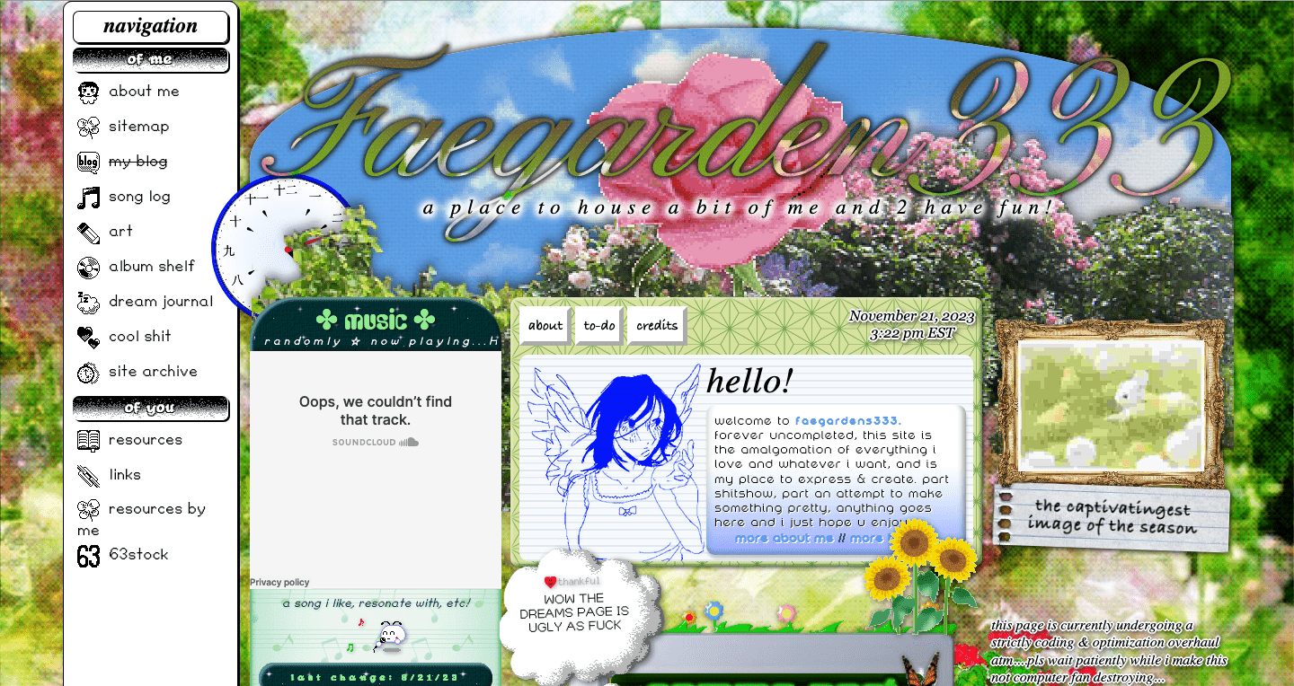
Here we see a return to some of the motifs I used in 1/1.5, such as a computer with content displayed on its screen, the general structure, dome-shaped banner as a header etc. Using my coding knowledge I also realized some ideas I had when making the first version but didn’t have the skill to realize. But I also carried along some things apart of v2, such as the black and white pixel look for the navigation bar & the header’s animated background of the flowers blowing in the wind now being clipped to the cursive header text. I also used the same design for the music box which has been present in all versions since v1.5.
Basically, I combined my expanded css knowledge with elements from previous homepage designs and my taste for clashing design styles to create this. Also, it was sort of inspired by philia955’s homepage at the time.
It has something going for it I think. It’s pretty cute and did its job, and hopefully you can see my css improvement aka finally straying away from using position:absolute (and moving onto transform: translate()). And although I discovered it and it is present in v2, by now I started really abusing background-blend-mode. I liked the ability to layer backgrounds to create interesting patterns just liked the visual effect of it; it’s something that I also incorporate into my art a lot too.
It feels like so long ago I made this that I can’t remember what I felt when I finished it but I think I was proud (lol).
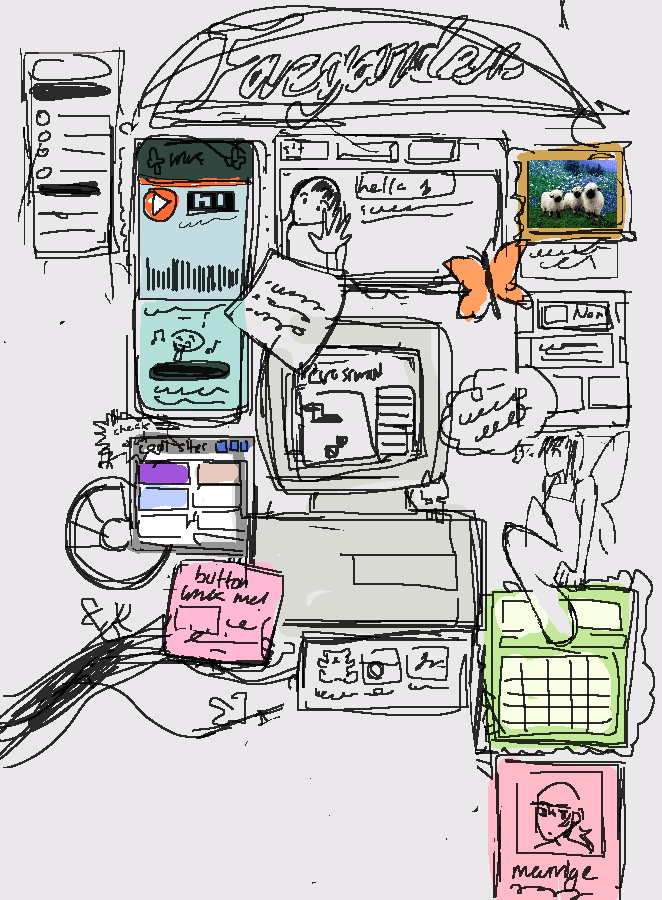
This version came with a new 88x31 button! I toyed around with the idea of repixelling the deer one but I was too lazy so much so the laziness wrapped around and I decided to create a new one entirely from scratch. I used a photo editor to create the four frames seperately and treated it almost like an advertisement, frames 2-4 describiing like what you'd find on my site (art, my interests, & more. kind of vague but umm yeah).
Also I may or may not have made the original canvases like 3x the 88x31 ratio so up close it's super low quality but aahahhahaha what can u do.


Somewhere along the line I also repixelled the icons used for the navbar so they were more identifiable. For the original icons, I used a relatively big canvas + 1 pixel brush but then resized them to be like 20 pixels and even added the image-rendering: pixelated attribute so they rendered like shit.





And then some time after that I became aware of the concept of website accessibility and started scrambling to try and adapt this to meet some standards, but given it’s nature, it was kind of impossible. Also, my understanding of the standard accessibility expectations was flawed. One day I spent like a whole morning turning all the hyperlinks into a button inside a form like a dumbass all because I thought all links had to be accessible thru keyboard only/tabbing.
Unfortunately, it’s a cold hard fact my love for flashy clashing graphics and the importance of site accessibility fundamentally can't work harmoniously & can’t both be jointly 100% satisfied. That was something I eventually realized (but is a battle I’m still fighting xp) so I decided to start creating homepage v4.
Other Defining Pages of This Version
Archive page
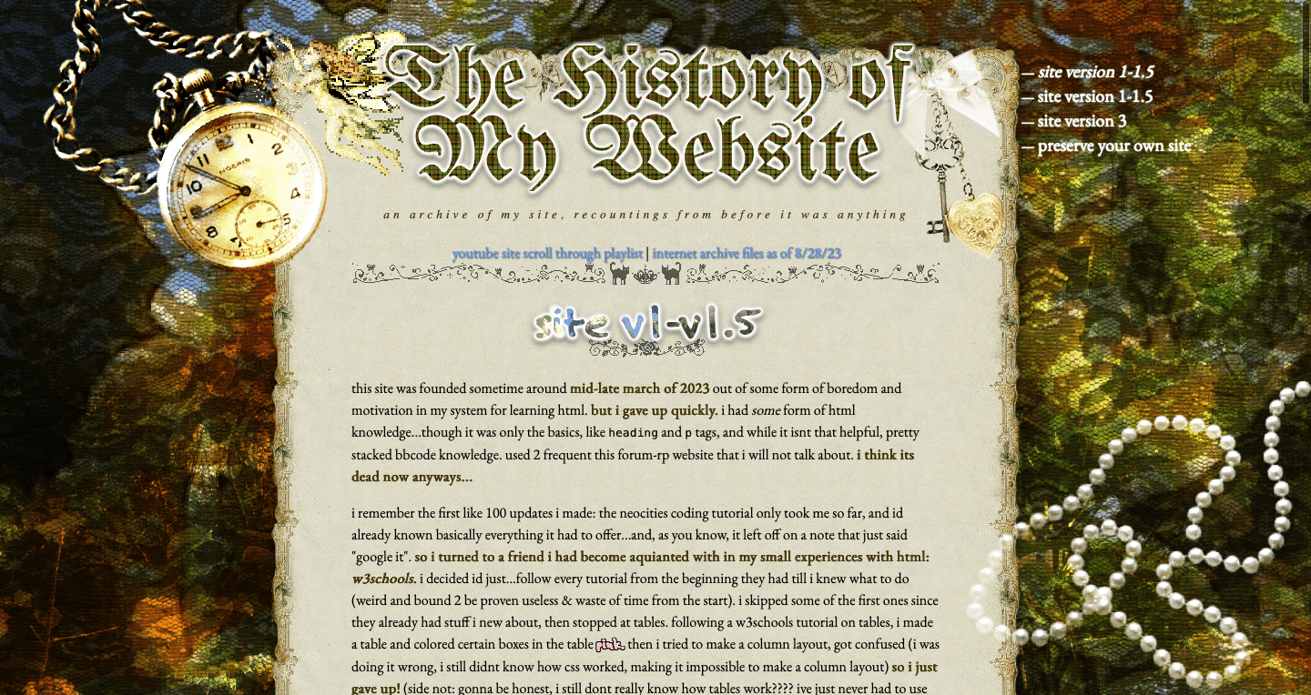
center html tag, hotlinked everything ever, etc.) but it doesn't look like the worst. You can see my affinity for mix-blend-mode & background-blend-mode shine here.About me page
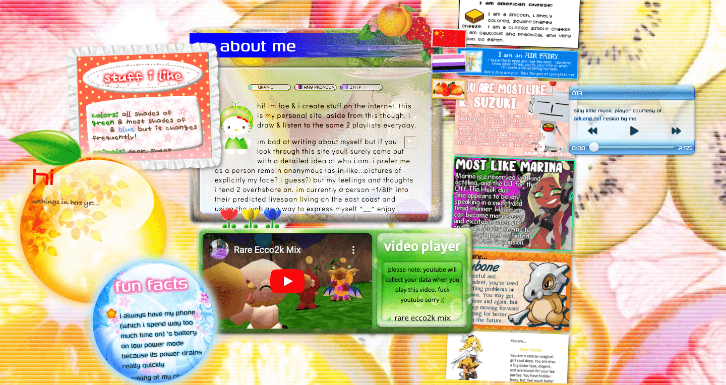
site v4
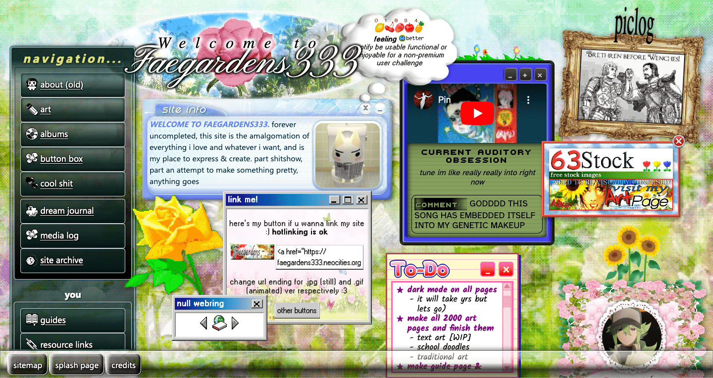
As I was beginning to get at in homepage v3’s log, I went into making this hopefully to combine my design style but adapt it to be accessible. There was also this idea that spawned in my head a while before of a homepage that was like a computer’s home screen and all the textboxes were windows (notice the faux minimize, maximize, and close controls I added to the top right of some of the “windows”/sections). Not like that was an original idea but I thought I could give it my own spin and I guess that spin was doing my mish mash of styles style.
Like last time, I carried some things I’d used in previous homepages such as my own diy not 100% accurate windows 95’ style css first created v2 (I think) for all the windows related to outlinking (my button, the null webring, other site’s buttons), and gave the windows a shuffled/overlapping look not just to sell the “windows on a home screen” idea more but also to mimic my previous layouts that made visual use of not being perfectly linear in a similar way.
I did that by using flexbox as a base then the css properties transform: translate() and margin: auto (technique originally developed v3 I think?). Also, through flexbox and z-index finessing, I changed the order layers of some components to hide the evidence of the rigid grid of the flexbox even more which created some interesting visual layering in my opinion (i.e. the header’s cursive text on top of the nav menu but the header’s backdrop being behind it).
Speaking of the header, You’ll notice it’s much less prominent than previous iteration’s. It felt it fit the vision better this way.
And speaking of the yellow rose, in this layout, I attempted to fill more space/add visual interest through the boxes housing the content instead of adding a bunch of gifs. It’s pretty plain in this way compared to previous versions, but I still added a few images of flowers as decor.
Since maybe v2, I’ve always thought the homepage had to be the grandest page of my site, showcasing the peak of my skill front and center. This makes sense in a way I guess, since it is the homepage, which logistically will be the most visited page on your site as it functions both as the door into your site as well as the channel to access all the other pages. But recently, I’ve changed my thinking (I’ll get into that with my log of homepage v5 tho).
Anyways, that was one of the core ideals driving the direction of this version, so I thought I’d try my best to pay as much attention to detail. I’d gotten into emulating skuemorphism/design with depth (one of my initial ideas was to use this CSS framework recreating windows 7 ui but I decided against it) so I encorporated that into the hompage, most obviously in the navigation, which got a thematic revamp from the one that lasted v2-3. (Side note: Oh my god…just realized…it’s literally like the evolution of computer ui….from pixel b/w (maybe unintentionally inspired by early mac ui) to the deep-depth design (a la windows vista/7)…am I a multimedia narrative genius?) But I also drew some inspiration from apple’s aqua ui for the ‘site info’ box
I think this was a major step up not only in my css but also html skills cause I started using more sematic tags like nav and header instead of just using divs for everything.
But at the same time, I still cut a lot of corners & it isn’t near perfect. Essentially every window/section had their own theme so I used a lot of css real estate to refine and polish all of them individually. In the end, the css was so long and laggy I had to chop it up into 3 whole ass files.
On accessibility, I created a mobile version for this version, but it involved hiding the navbar. I was going to have it collapse into a dropdown, but my coding skills weren’t up there yet so I settled on a halfassed solution. You may have noticed the bar at the bottom, which had a ‘sitemap’ tab I intended to link to a sitemap page so mobile users could navigate the site that way, but when I made it I didn’t even have a sitemap page up until recently, months after this page’s debut. So that’s not the best. Also, the flow of the content was weird on mobile. Because I was limited to flexbox’s abilities (could not bring myself to learn gridbox yet), so I could only manipulate the content to stack on top of each other, not reorder it.
Also, I tried to keep in mind text contrast and aria roles/attributes. I put it on my list that I would add a dark mode but that a promise I wasn’t committed to at all because considering how I built this page up implementing a dark mode might actually kill me. I played around with the idea of just adding a filter to the html to like invert everything but that’s like cheating and didn’t work/look good anyways.
But still, overall, was and still happy with it, it served it’s purpose very well and I learned a lot making it. Kind of a classic maybe.
Other Defining Pages of This Version
About Me page
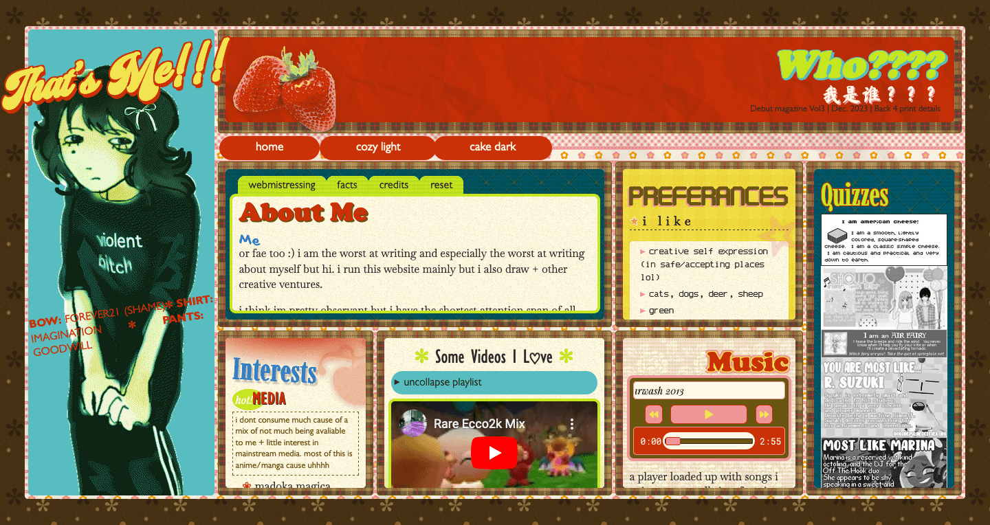
gridbox omg!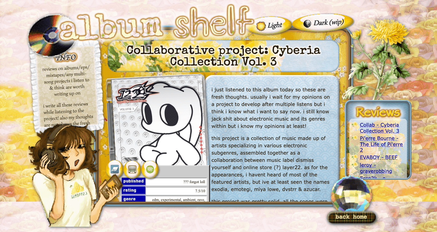
background-blend-mode into images in hopes of making it less laggy, maybepreserving your own site
preserving your site is a very important part of running one! it captures the progress and effort youve put into it. it helps record it, however unimportant your site is, as a note in the history book. and while its not exactly mandatory, in an everchanging ecosystem like the world wide web, preservation and documentation will let your site live on, even if neocities goes down in flames dies like geocities did.
i didnt start archiving my site well until recently. thats why captures of early versions of my site are broken and largely unaccessable. however, ive learned ways to better save my site.
the most important thing you do is to upload it onto the wayback machine. make sure to check "save outlinks" (so it attempts to save all other pages attached to your website). other checkboxes are largely up to you. it may take a lot of time to upload, but especially if your sites complex as fuck like mine be patient about it (you may have to retry a few times). when its done, youll have a capture of your site in that point in time. updates you make to it after its been all uploaded (or maybe right after you upload the url for saving, im not sure) wont alter the capture. if you want to make a new save later in time, then youll have to upload the site url again to be downloaded again.
you can also use web archive to upload files of your site, or anything else you want preservation of, thats the point of the internet archive obviously haha.
another important thing you should do is to go to your neocities dashboard, scroll down, and click "download entire site". this will download a zip file with all the files that youve saved to your server. in my experience it breaks and is not perfect, but you have the raw html and css files so -b